

The Golden Embrace: Why Butter Color is the Perfect Hue for Your Home Interiors.
Tired of stark whites and endless grays, but not ready for a bold splash of primary color? There’s a hue that perfectly straddles the line between refreshing neutral and comforting warmth: butter color.
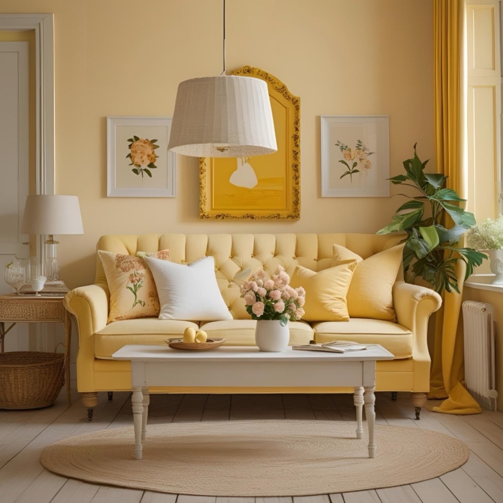
Not to be confused with a vibrant, energetic yellow, butter color is the softer, more sophisticated relative. It evokes the mellow glow of sunlight, the creamy richness of its namesake, and the comforting feeling of home. This nuanced shade, ranging from pale, almost-white creams to deeper, goldenrod-kissed yellows, is becoming an interior design darling for its ability to infuse spaces with a subtle radiance and an undeniable sense of welcome.
Why Choose Butter Color for Your Home?
- Unrivaled Warmth: Butter yellow brings an instant feeling of coziness and warmth to any room. It acts like a permanent ray of sunshine, chasing away gloom and making a space feel inviting and friendly, even on the dreariest of days.
- Timeless Versatility: Unlike trendy colors that come and go, butter color possesses a classic appeal. It suits a myriad of design styles, from rustic farmhouses and traditional homes to contemporary apartments and bohemian havens. Its adaptability ensures your interiors will look fresh and appealing for years to come.
- Mood-Boosting Magic: Yellow, in general, is associated with happiness and optimism. Butter yellow delivers this positive energy without the intensity that can sometimes overwhelm. It promotes a sense of well-being, cheerfulness, and gentle stimulation, making it ideal for spaces where you want to feel uplifted and comfortable.
- A Gentle Neutral Alternative: For those who find pure neutrals a little too cold or uninspiring, butter color offers a wonderful alternative. It’s light and airy enough to keep rooms feeling spacious, yet it adds a depth and character that more sterile shades often lack. It acts as a versatile backdrop, allowing other elements to shine without competing.
How to Incorporate Butter Color into Your Home.
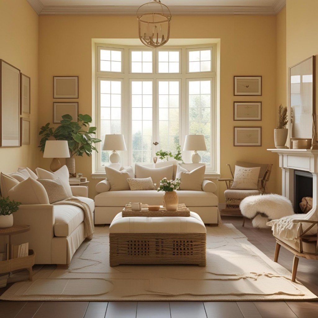
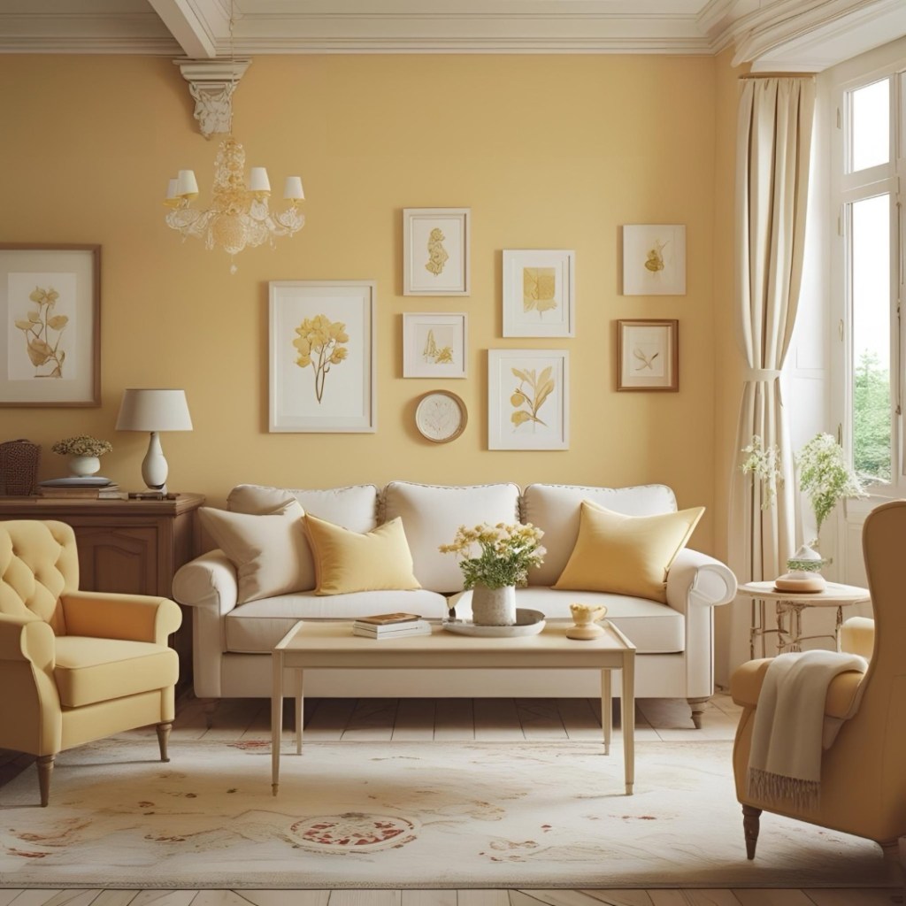
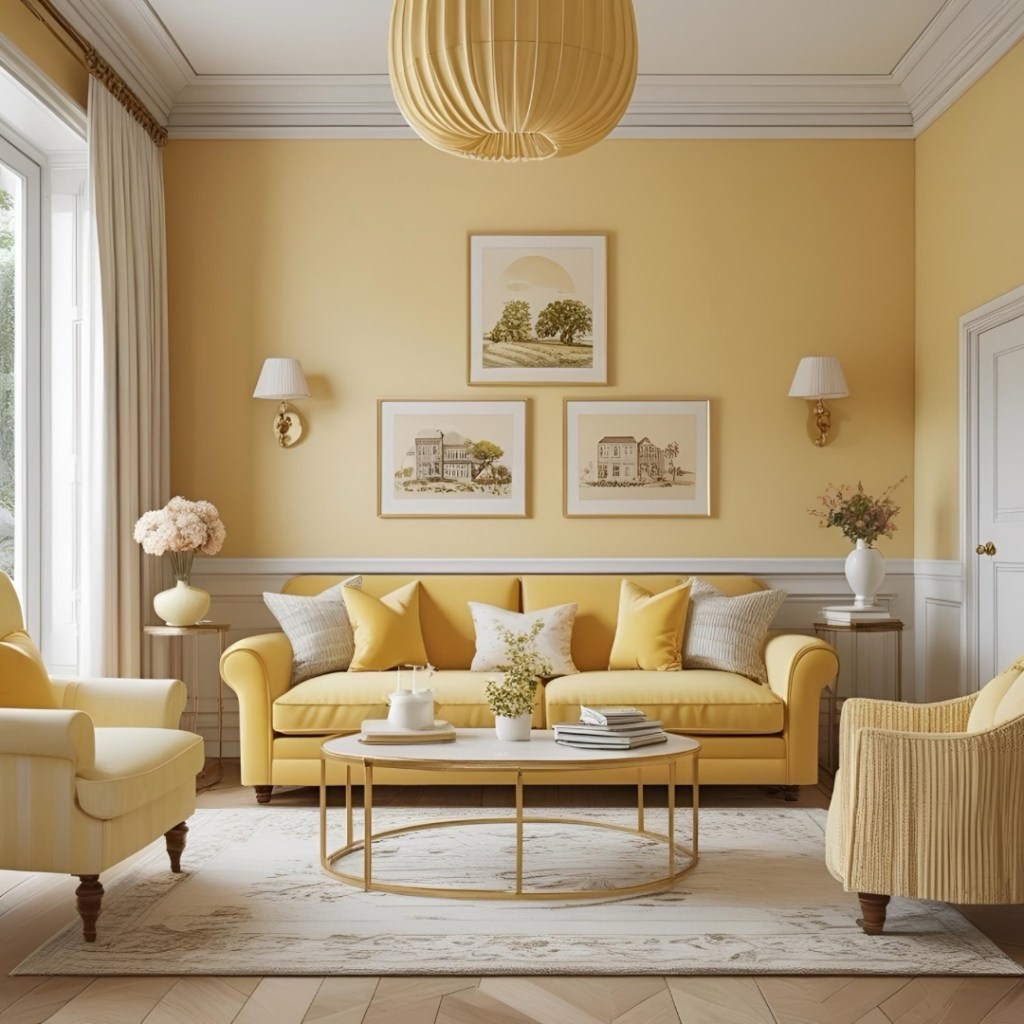
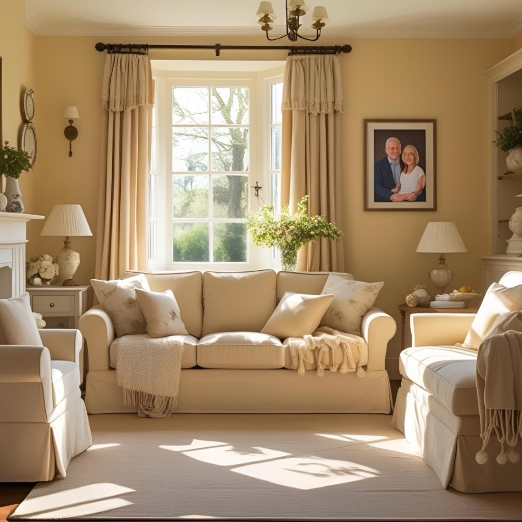
1. Walls That Whisper Welcome: * Full Room: For an enveloping embrace, paint an entire room in a soft butter yellow. This works beautifully in living rooms, dining rooms, and even bedrooms, promoting relaxation and warmth. * Accent Wall: If you’re hesitant to commit, choose one accent wall to highlight with a richer butter shade. This can draw attention to a fireplace, a collection of art, or a key piece of furniture.
2. Furniture Finds: * Upholstery: Imagine a plush sofa or an inviting armchair upholstered in a beautiful butter-colored fabric. It instantly becomes the focal point, exuding comfort and style. * Painted Pieces: Give an old dresser, a bedside table, or kitchen chairs a new lease on life with a fresh coat of butter yellow paint. It adds personality and charm.
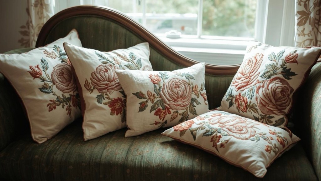
3. Textiles and Accessories: * Soft Furnishings: This is the easiest way to introduce butter color. Think cushions, throw blankets, curtains, or area rugs. They can add pops of warmth and texture without a major commitment. * Art & Decor: Incorporate butter yellow through artwork, ceramic vases, lampshades, or decorative objects. These smaller touches can tie a whole room together.
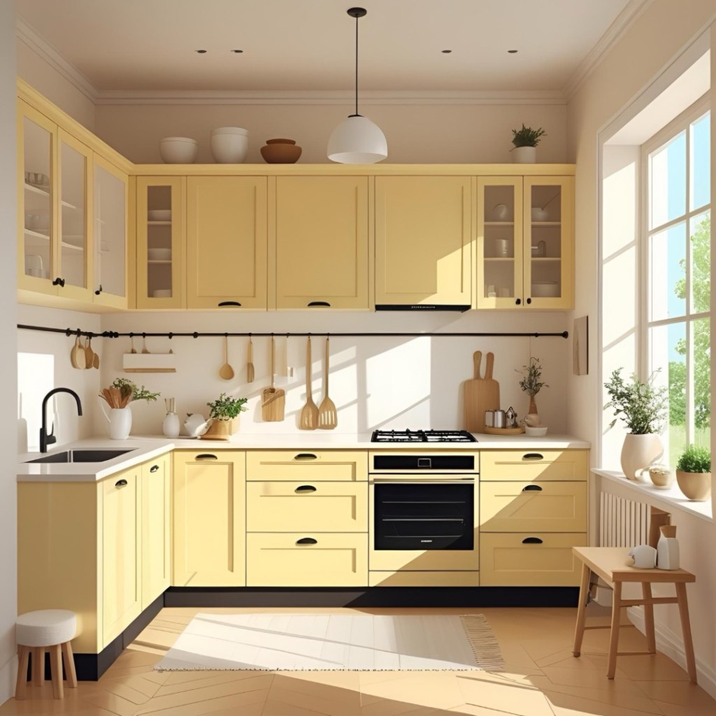
4. Kitchen & Dining Areas: * Given its name, butter color feels right at home in culinary spaces. Consider it for kitchen cabinets (especially upper ones), or use it for dining room walls to create an inviting atmosphere for meals and gatherings.
5. Bedrooms & Nurseries: * The calming, nurturing quality of a pale butter yellow makes it perfect for bedrooms, promoting restful sleep. In nurseries, it creates a cheerful yet soothing environment for little ones.
Pairing Palettes: What Colors Go With Butter?
Butter color is a team player. Here are some harmonious pairings:
- Crisp Whites & Creams: For a fresh, airy, and truly classic look. This combination feels bright and clean.
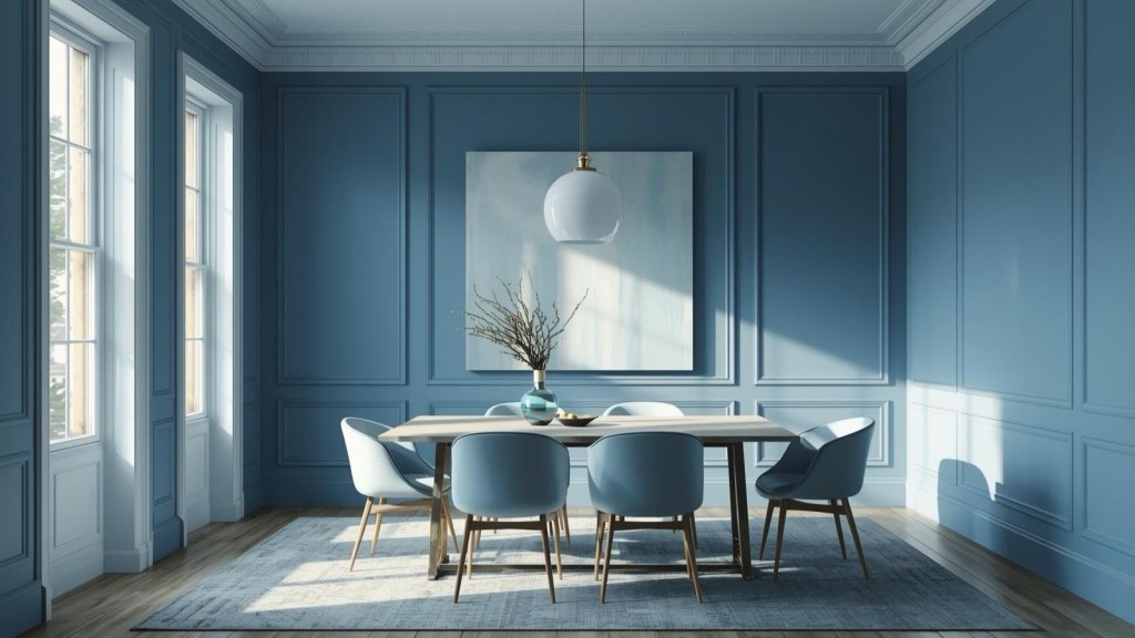
- Soothing Blues & Greens: Inspired by nature, these pairings create a balanced and serene environment. Think pale sky blue, muted sage green, or deep navy for a sophisticated contrast.
- Rich Grays & Charcoal: To add a modern edge. Gray provides a sophisticated backdrop that makes the butter yellow pop, while charcoal offers a dramatic anchor.
- Earthy Tones & Naturals: Think warm browns, terracotta, olive greens, and natural wood tones. This palette creates a grounded, organic, and incredibly cozy feel.
- Metallic Accents: Gold and brass accents enhance the inherent warmth and luxury of butter yellow, adding a touch of sparkle. Silver and chrome can introduce a cooler, more modern contrast.
Tips for Success.
- Consider the Light: Test paint swatches on your walls to see how the color changes throughout the day with natural and artificial light. Butter yellow can appear more muted or brighter depending on the lighting.
- Choose Your ‘Butter’ Carefully: There’s a wide spectrum. A very pale shade will feel more neutral and expansive, while a deeper, more golden butter can make a room feel cozier and more saturated.
- Balance is Key: While butter color is inviting, too much of any color can be overwhelming. Balance it with contrasting or complementary colors, textures, and patterns to create visual interest.
- Swatch Before You Commit: Always buy a sample pot and paint a large swatch on your wall (or on a board you can move around) before committing to a full room.
Butter color is more than just a passing trend; it’s a timeless hue that offers comfort, cheer, and sophisticated warmth. By embracing this golden embrace, you can transform your home into a truly inviting and joyful sanctuary.
If you liked my blog post “Butter Color for your Home Interiors” have also a look at Decorative Upholstered Benches for a Cozy Home


Leave a comment