

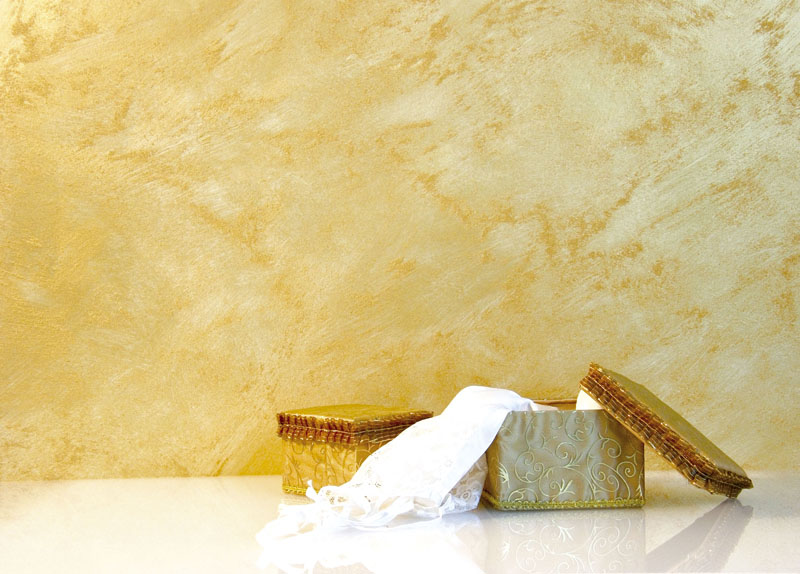
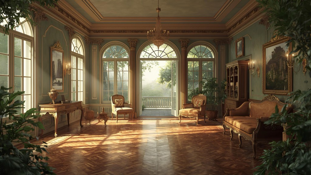
Desert, stone, pale ochre and dark wheat shades. The desert in my home.

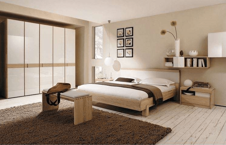
Sand is perfect for the Nordic countries because it compensates for the greyness of natural light and warms up the space without having to resort to other banal and abused colours such as magnolia.
The sand, today’s most sold colour, has been obtained by mixing three basic pigments: earth of natural shade, burnt shade and ochre yellow, all warm and enveloping shades. Placed at the lightest extremity of the chromatic spectrum, sandy colours include various shades: from pale ochre to dark wheat, from desert shades to stone shades. Sand shades are more restful than lemon yellow and are often used as a base for neutral pallets. They work well in combination with earthy tones, dark terracotta or intense cinnamon, alone or as neutral backgrounds for colored elements.

In order to add a touch of vitality, sunflower accessories such as tablecloths, paintings or furnishing accessories can be used to create a “sunray”effect. Alternatively, harmonious tones such as sandstone, beige or mole can be used, alternating with ivory or neutral white.

The overlapping textures are perfect with the sand paddles as they evoke beaches and deserts. Pale sand and stone grey shades are perfect for arminic or saturated tones. The ochre makes the environment discreet, elegant and welcoming especially when combined with earthy colors.


Leave a comment