Milk or Bitter Chocolate? What’s shade suits better for your home?

Chocolate tones, spicy shades and elusive nuances of the mole and adobe lend themselves to happy and elegant combinations.
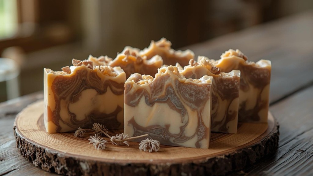
Chocolate shades are perfect where warmth and comfort, sober luxury or an elegant background are required. The shades of milk chocolate are ideal to highlight delicate paintings or fabrics, silks and damasks handmade, impalpable veils or fabrics such as linen, rope and damask cotton.

Intermediate tones, such as toffee and burnt shades, can be both cold and cold but always very delicate. Caramel and cinnamon combine well with creamy grey-brown or oat and butter shades.

Dark chocolate schemes can be very suitable for bedrooms or public places. Although the choice of dark chocolate shades is in itself spectacular, it can be emphasized by a pale or lit touch of turquoise or pink for a bold chromatic complement, in the form of carpets, works of art, cushions, etc….



In conclusion, chocolate is a diplomatic colour, it is calmly calm but not released, does not monopolise attention and adapts to any context. It is part of the earth colours, organic and timeless, natural and warm, suitable for any environment and for any type of light, especially when used with matt and chalky finishes.



Leave a comment