

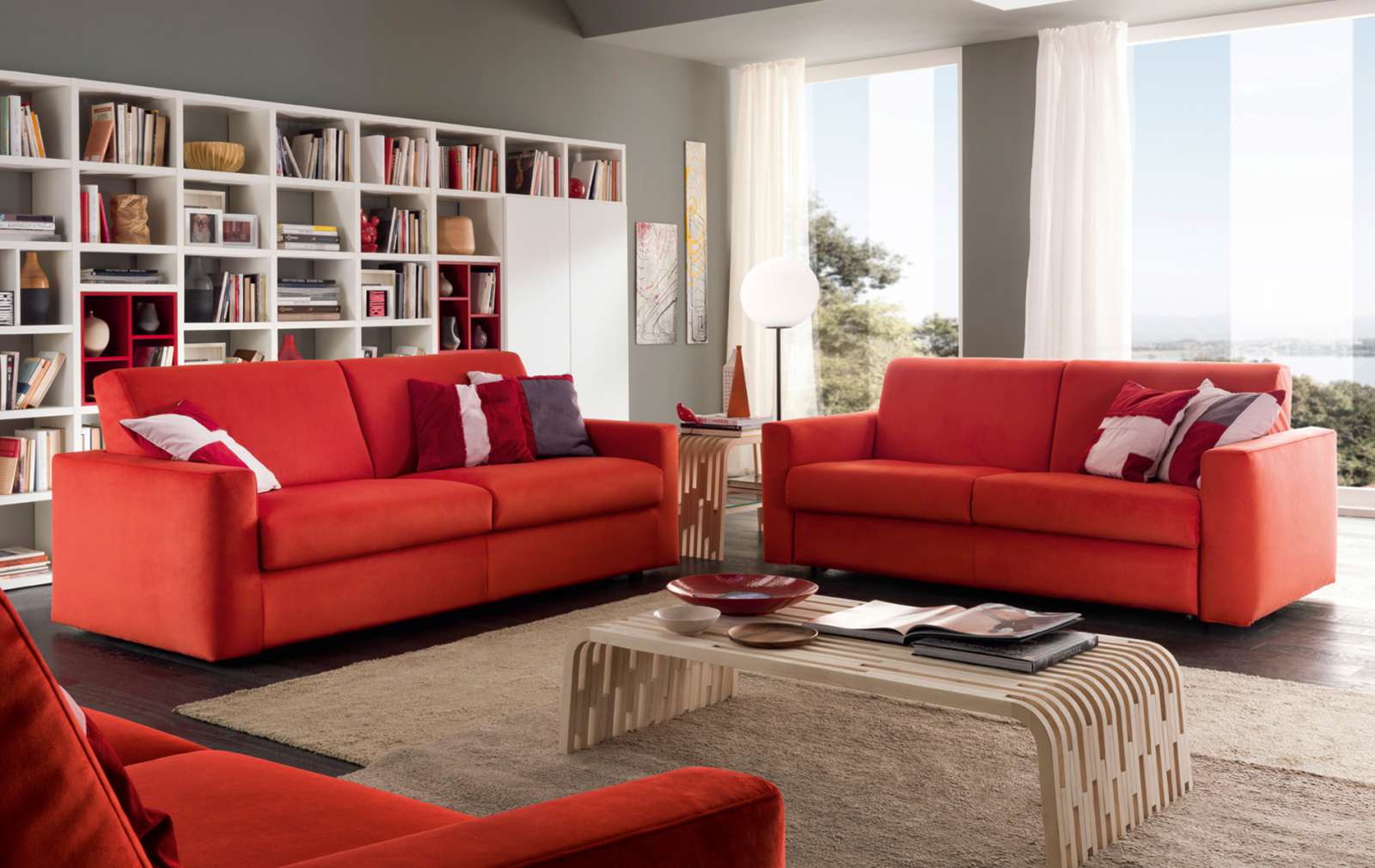
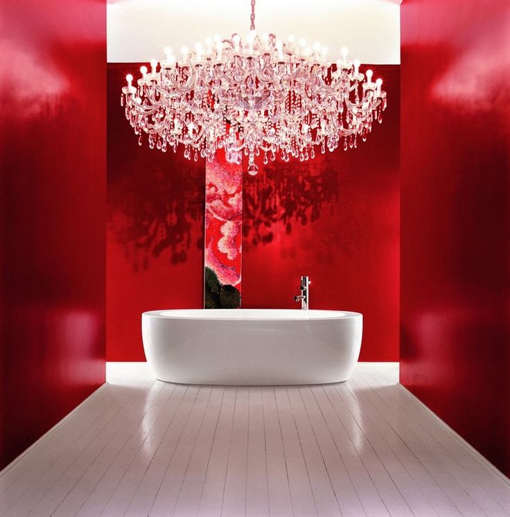
Color of passion, fire and blood, red is a powerful and evocative color, sensual and allusive, warm and provocative that recalls the movement making comfortable and daring environments. Given its psychological effects it is used to decorate mainly kitchen, living room and dining room rather than other environments. Because of its intensity and energy, red should be used with caution, but red terracotta and wood, for example, are able to transmit heat and energy without necessarily imposing themselves in an excessive way. To attenuate the natural electricity of red, on the other hand, it is better to combine it with neutral light shades: pure white gives an unmistakable Scandinavian touch, buttery shades create a rustic atmosphere and the textures of jute and linen add a touch of contemporary country style. Red expresses all its dynamism when it is combined with natural colours such as light oat beige or greys, but also with chocolate and dark slate tones. In furnishing, red is traditionally associated with luxury, especially when combined with gold or golden surfaces. Since before the invention of synthetic colours, around the middle of the nineteenth century, red pigments were very expensive, their presence in the reception and dining rooms and art galleries was considered a sign of wealth and exclusivity.


Leave a comment