

Living Coral: the colour of 2019! It symbolizes our innate need for optimism and the pursuit of happiness.

How to use the Living Coral to furnish a home? Some professionals from all over the world explain how we can include coral in our interiors and, just as importantly, the mistakes to avoid. Although there are many different opinions on the right combinations, one thing is clear: this vibrant and calm shade is so versatile that the final effect depends only on the use made of it!

A refined colour
Some interior designers are talking about a return to experimentation: “Coral was very much in vogue in the 80s and is now back to be articulated on everything from walls to accessories. It’s a versatile colour that can seem bold, modern, elegant and relaxing at the same time, depending on how you use it.
This shade contrasts with larger opposing tendencies. “Coral differs from the current colour schemes, which in furniture favour intense greens and blues, moss green and lichen, and desaturated colours containing touches of black. It is therefore a beautiful colour for those who are ready to dare with originality”.
It’s a difficult colour, for a few, I don’t think it will become popular and widespread. The main reason is that people are afraid of quickly getting tired of intense colors and therefore prefer neutral or dusty palettes.

Colour combinations with the Living Coral
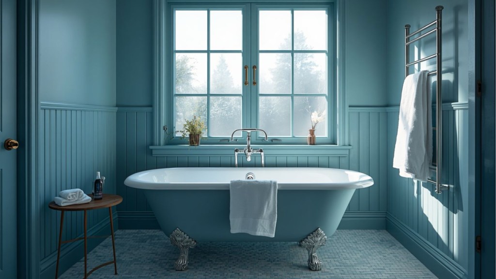
To dampen the liveliness of the coral comes to our aid nature. A relaxing atmosphere can be created by combining this shade with natural colours and materials, such as green and wood. Because of its red and cold component, it can be heated with a few touches of brown, ochre or beige. It can also work in harmony with pink, powder and flesh-coloured, but care should be taken not to exaggerate. It may also work well with violet. And if you want to match blue or green, it is preferable to opt for steel blue – which has a hint of gray – and khaki. One of the reasons coral could be destined to depopulate in 2019 is that it fits perfectly with some of the natural palettes seen this year, as many of the professionals interviewed agree. In addition to this certainty, it seems that the combination of coral is a matter of taste. It is perfect with light woods, but it is preferable not to combine it with amber and dark woods. Living Coral is wonderful when combined with greens – sage, emerald, water – but it also works well with soft shades such as beige, rope and powder pink. We have to be careful when matching it with warm colours such as red and orange, because they make the coral too warm. Even if you love warm colors, excessive use could enhance the effect and compromise the relaxing atmosphere.


Living Coral: in abundance or in small doses?
Since Living Coral is such an extraordinary colour, it can be a great ally to draw attention to interesting architectural elements. Remember that if you try to make everything stand out in one room, then nothing happens. It can also be a way of visually delimiting a space, I think coral can work well to attract attention. You can use it in the middle of a room to highlight the main element, such as a bookcase. And of course for small accessories: for example on pillows, rugs, vases, on a wall or using wallpapers.


Tips and tricks
As with most colors, some tricks can help the coral to give its best. The trick with the use of coral is to choose the level of gloss. A matt or poorly polished finish is preferable. When coral is very shiny, it can take on a fairly synthetic appearance – which may have a cheerful, but not so sophisticated, impact. By choosing a matt paint that reflects the light in a very soft way, you can create a more delicate and relaxing space.


Are you ready to decorate your home with Living Colour? Choose your favourite furniture and start your project on Our Cozy Shop
If you liked our blog post “Living Coral: the colour of the year!”, have also a look at Autumn Winter Furnishing Trends


Leave a comment