

Matching the lilac color in the home: discovering the features of the most hygge colour.
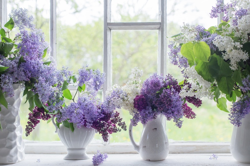
Lilac is a colour variant similar to purple but with a softer hue. Its terminology derives from its similarity to the lilac flower which represents the colour.
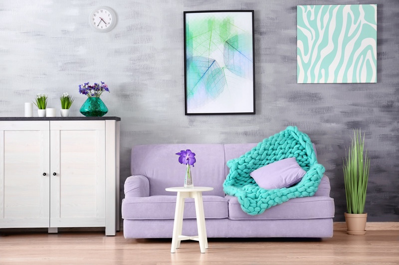
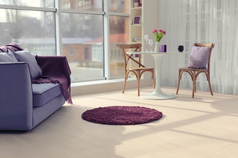
Lilac is definitely the most hygge colour there is, as it conveys serenity, peace and at the same time reflects elegance and charm. Lilac can be used to create interesting contrasts with diametrically opposed colours such as beige, black, grey, acid green and white.

Combined with white, it is perfect for decorating children’s rooms or bathrooms. Combined with beige and brown tones, it creates a very cosy atmosphere in the living room where you can even dare to paint whole walls.

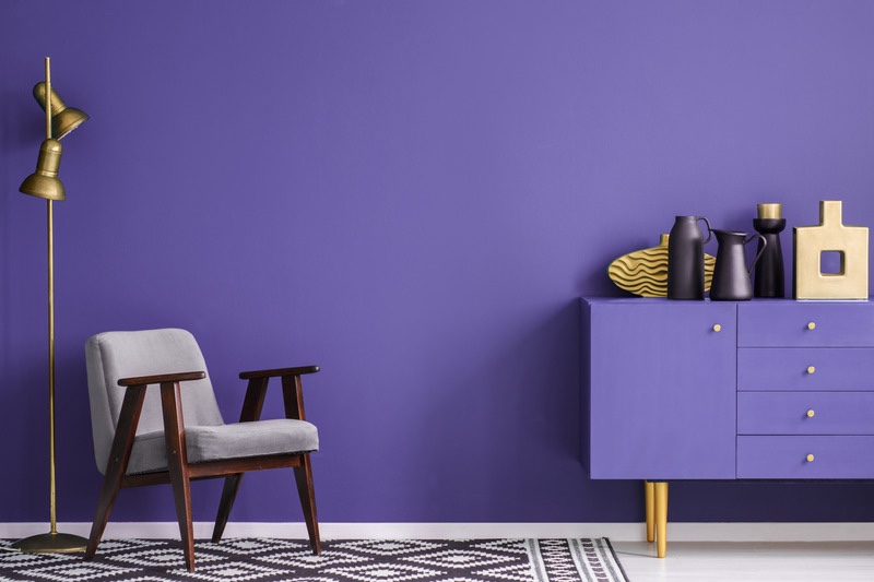
The softer shades of lilac are suitable for Scandinavian and minimalist interiors, the more intense shades will match better with modern interiors; it is better not to use this colour to decorate the kitchen to avoid the ‘candy’ effect.
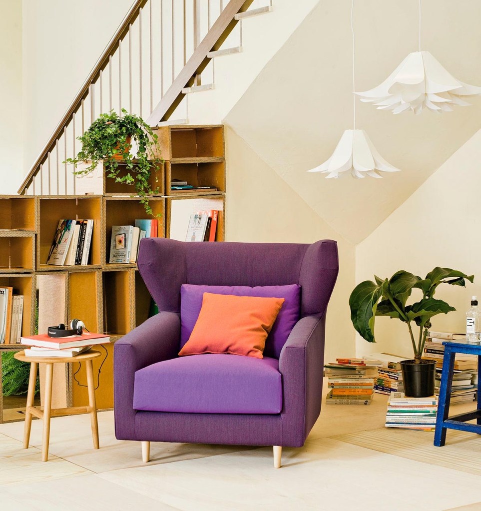
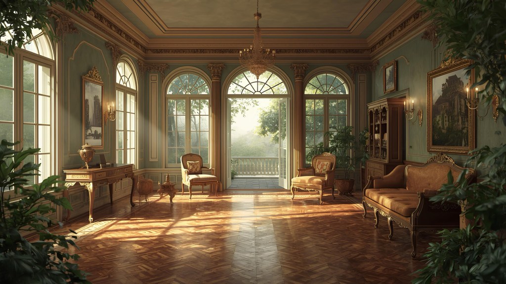
Get the look with Folk armchair
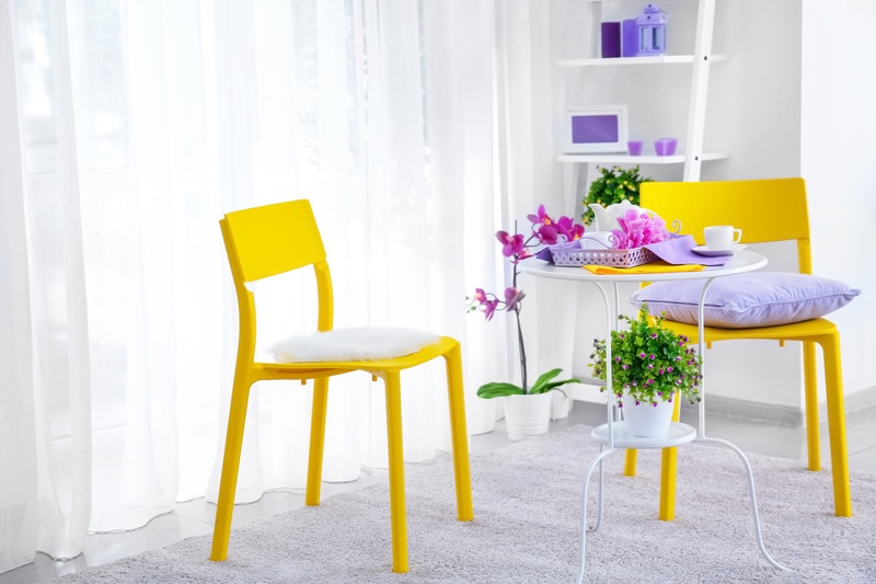
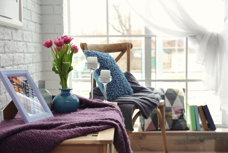
Lilac is the ideal colour for renovating your home at this time of year, as it is the symbol of spring in most of the flowers that bloom during these months. If you are afraid of being too daring with this colour, use it in small doses on accessories, carpets, rugs or curtains.
If you liked my blog post “Matching the Lilac Color in the Home” have also a look at Decorating with Baby Blue Color


Leave a comment