

Pantone colour 2022: A new Pantone colour full of personality to stimulate inventiveness and creativity.
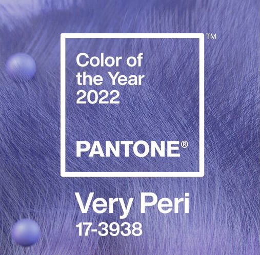
Bold, playful and intriguing! These are the key words that best describe Pantone’s new colour of 2022, the Very Pery! The Very Pery is enhanced by the qualities of blue while having a violet-red undertone that also allows for a lively and joyful attitude, a dynamic presence that encourages daring creativity and imaginative expressiveness.
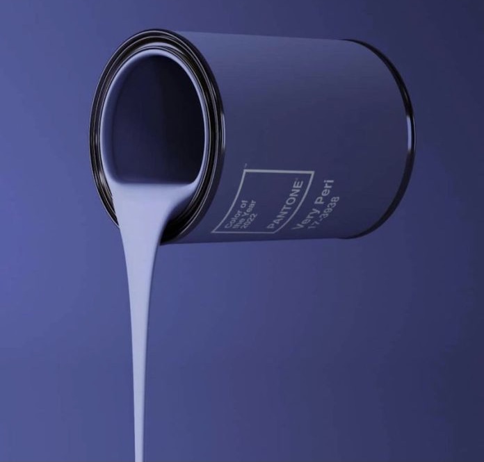
This new colour has been created to reflect the innovation and global transformation taking place in this historic period we are living. “As society continues to recognise colour as a fundamental form of communication and way of expressing, influencing and creating ideas and emotions, of engagement and connection, the complexity of this new blue hue infused with red-purple highlights the boundless possibilities that lie before us.”
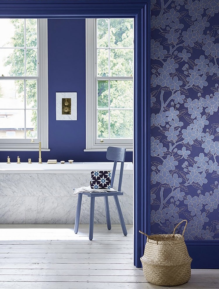
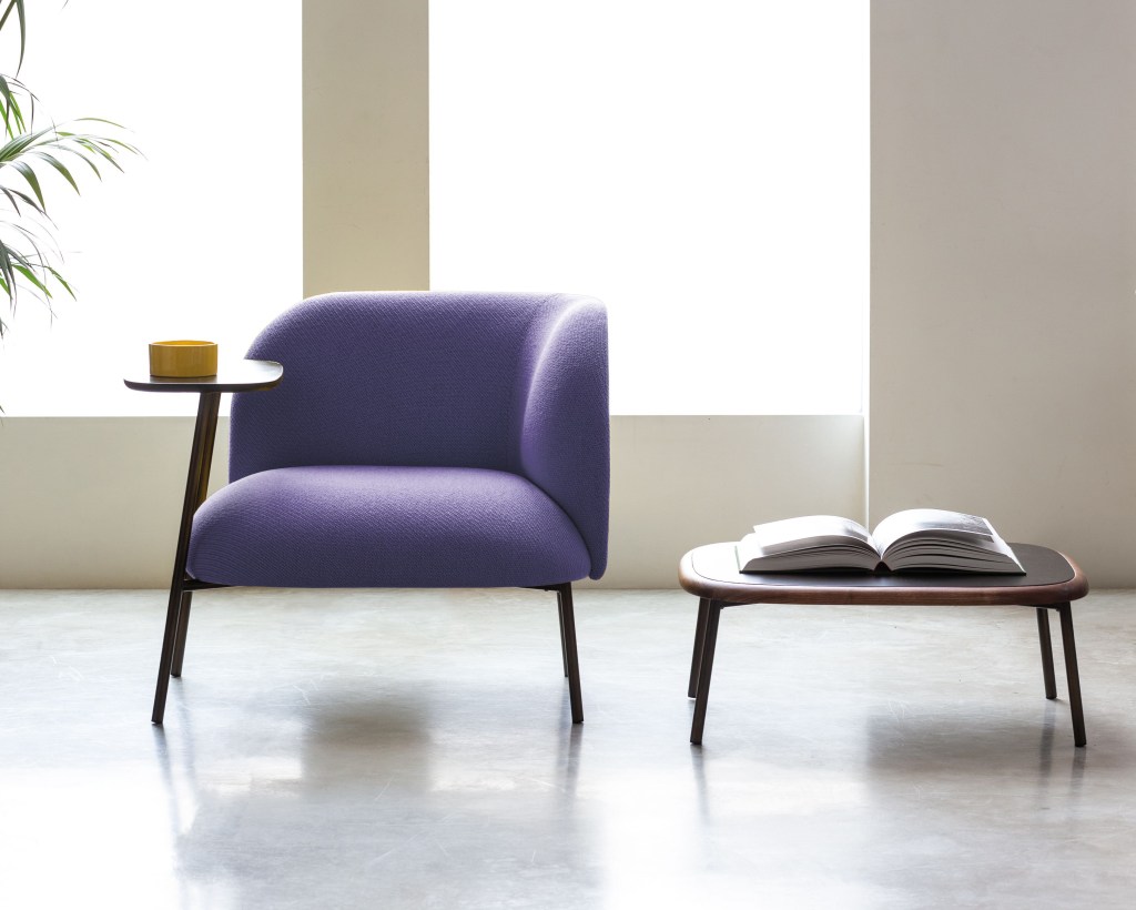
Very Pery will also be the colour of the year for interior decoration, and interior designers all over the world are already having fun with colour combinations. The possible combinations for home decoration are manifold. Very Peri goes perfectly with white to create a romantic and elegant effect.
The combination of these two colours can be exploited by alternating the painting of the walls to create more dynamic environments.

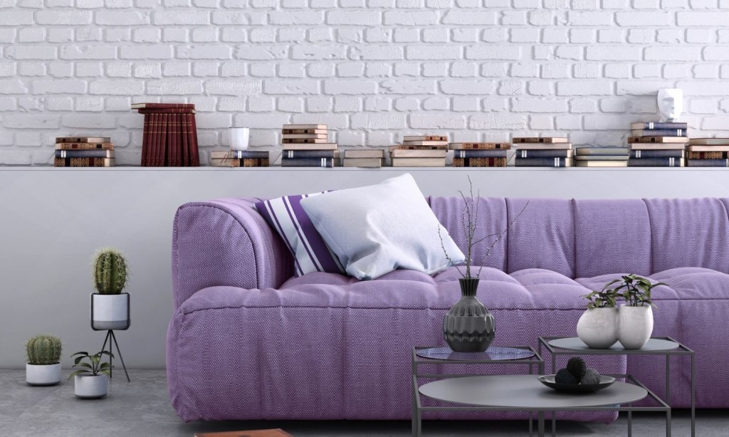
Other interesting combinations can be created with greys (preferably in light shades), with beiges and browns…
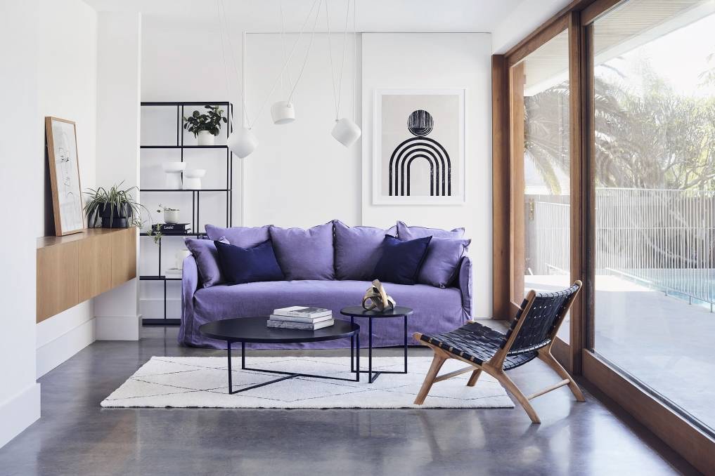
Interior designers recommend placing Very Pery in rooms with plenty of natural light to bring out the contrasts between the different colours.
If you liked my blog post “Pantone Colour 2022” have also a look at What Goes with Pale Pink


Leave a comment