

-

Hygge Art
Colourful, relaxing, abstract and intense. This is what Hygge art means to me. 13 paintings of a young artist, passionate about interior design and music, who loves to play with colours. 1 PROVENCE 2 SAD MONKEY 3 THE MOCK 4 BROKEN HEART 5 THE GROOVE 6 GALAXY 7…
-
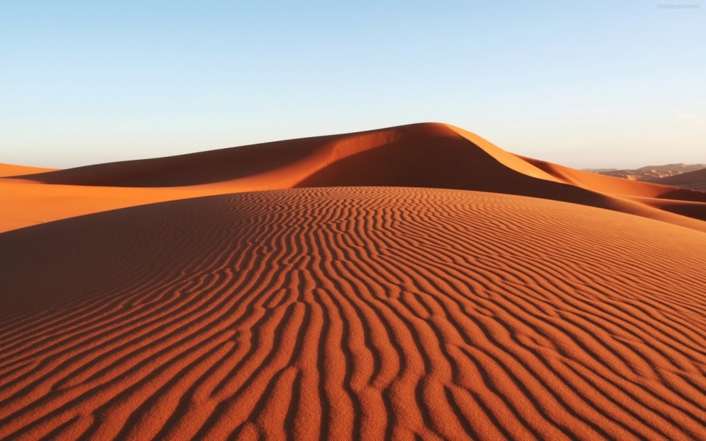
The desert in my home.
Desert, stone, pale ochre and dark wheat shades. The desert in my home. Sand is perfect for the Nordic countries because it compensates for the greyness of natural light and warms up the space without having to resort to other banal and abused colours such as magnolia. The sand, today’s most sold colour, has been…
-

Milk or Bitter Chocolate?
Chocolate tones, spicy shades and elusive nuances of the mole and adobe lend themselves to happy and elegant combinations.
-

PISTACHIO AND AVOCADO
Green represents growth, harmony and quietness. The green colour is very popular today thanks to the instinctive association with everything that is natural and ecological, bringing it back to the forefront among interior designers. Green has become an emblem of ecological consciousness. It represents faith and immortality, it is eternal as mother nature and is the…
-
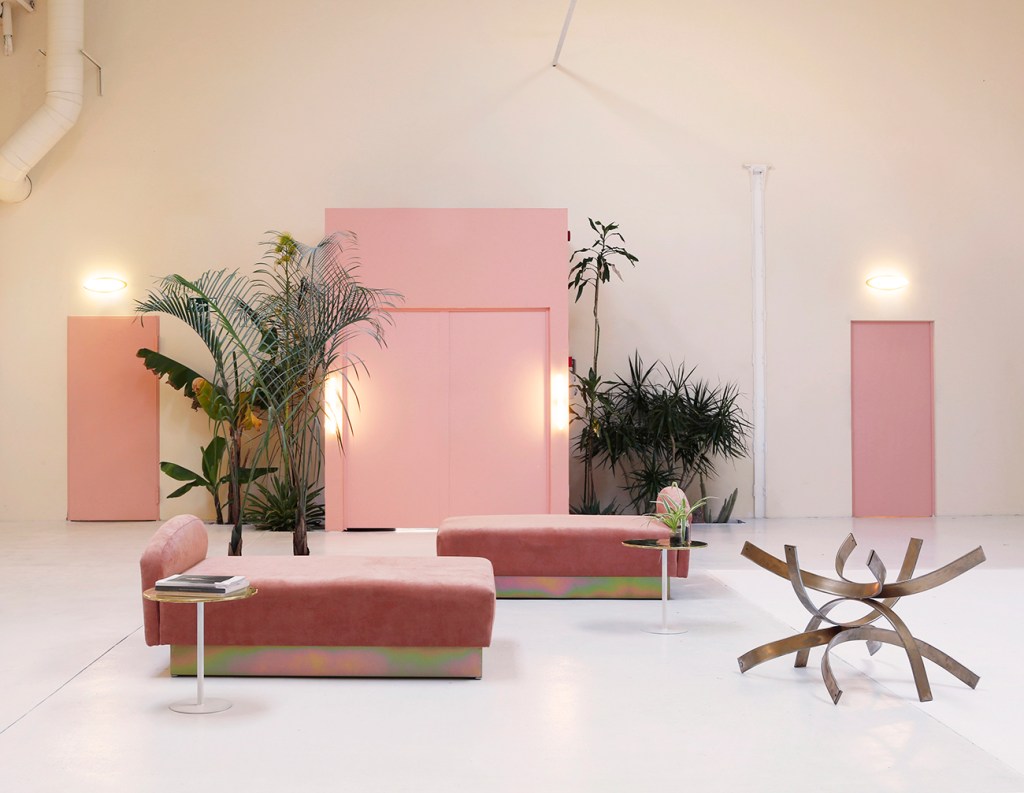
LA VIE EN ROSE
La Vie en Rose at home. Decorating with Pink! Pink is the colour closest to the Hygge current of thought. Discreet, relaxing, refined and seductive, it is perfect not only for the decoration of girls’ bedrooms but also for large living rooms, bright bathrooms and lively kitchens.Pink expresses its full potential when combined with the…
-
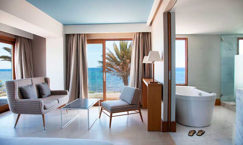
THE 3 MOST BEAUTIFUL DESIGN HOTELS
The 3 most beautiful design hotels in Europe. Discover more in this article.
-

PASTEL COLOURS
Soft, discreet, elegant and easy to use; pastel colours are adaptable to any type of space from the largest to the smallest, creating sober, delicate and vintage atmospheres.
-

BEDROOMS FOR KIDS
Très chic bedrooms!
-

MIXING COLOURS
Some useful tips for furnishing with Mixed Colors: – Excessive use of bright colours can lead to low concentration and make it difficult to relax the eyes especially in children’s bedrooms. – Combine different tones together without ever forgetting that the latter must belong to the same colour gamut in order to avoid reducing the…
-
BROWN
The most used colour in interior design! Never aggressive or intrusive, brown is a presence that turns out to be warm, calm and seraphic but never dimmed, does not monopolize the attention and adapts to any environment, whether it be convivial areas or bedrooms. Of great importance when choosing the range of browns is the…
