

-

PISTACHIO AND AVOCADO
Green represents growth, harmony and quietness. The green colour is very popular today thanks to the instinctive association with everything that is natural and ecological, bringing it back to the forefront among interior designers. Green has become an emblem of ecological consciousness. It represents faith and immortality, it is eternal as mother nature and is the…
-
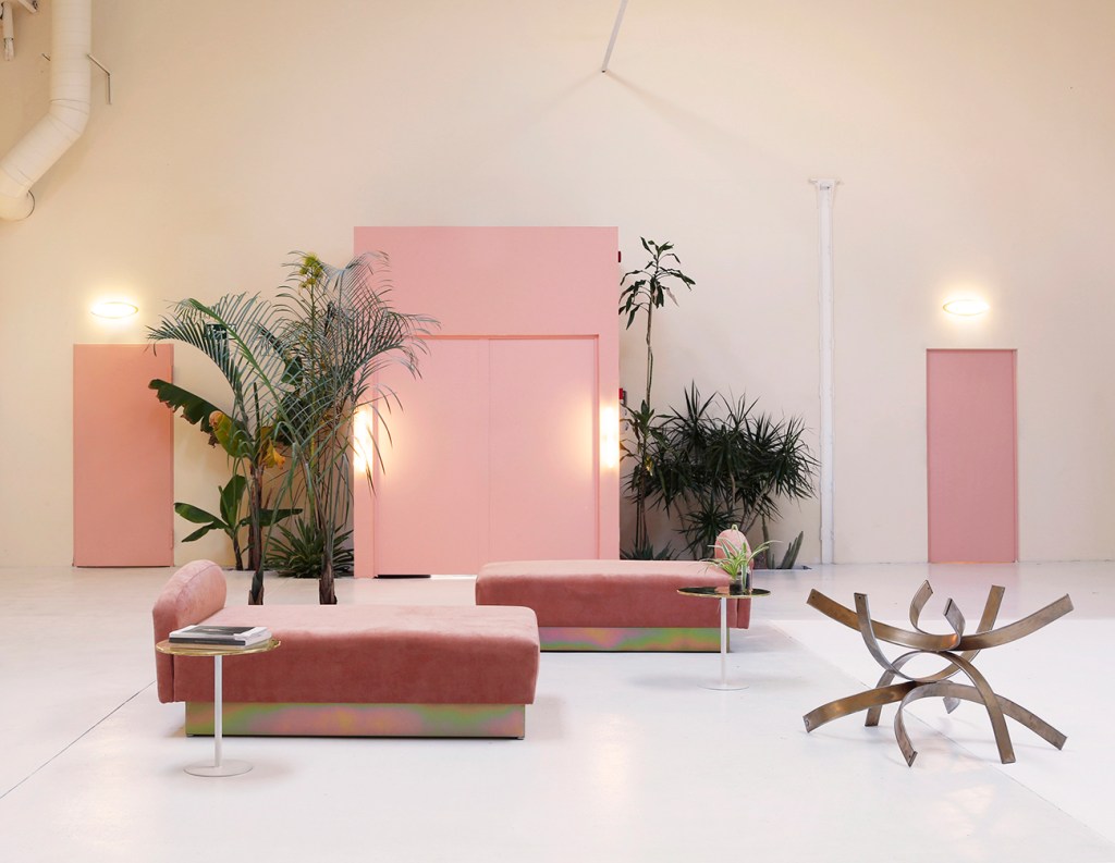
LA VIE EN ROSE
La Vie en Rose at home. Decorating with Pink! Pink is the colour closest to the Hygge current of thought. Discreet, relaxing, refined and seductive, it is perfect not only for the decoration of girls’ bedrooms but also for large living rooms, bright bathrooms and lively kitchens.Pink expresses its full potential when combined with the…
-
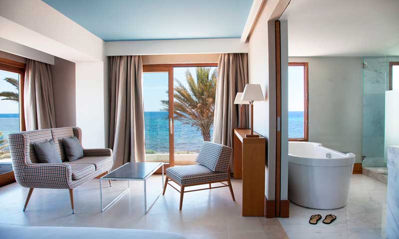
THE 3 MOST BEAUTIFUL DESIGN HOTELS
The 3 most beautiful design hotels in Europe. Discover more in this article.
-

PASTEL COLOURS
Soft, discreet, elegant and easy to use; pastel colours are adaptable to any type of space from the largest to the smallest, creating sober, delicate and vintage atmospheres.
-

BEDROOMS FOR KIDS
Très chic bedrooms!
-

DECORATING WITH LIGHT
Light is a very versatile and exciting decorative element, as well as creating suggestive atmospheres, it can alter the colour of walls, ceilings and accessories and at the same time fulfil a function of great importance: it allows to work and operate efficiently when the natural light is missing or is not able to meet…
-
THE INTERIOR DESIGNER
The interior designer is a qualified professional figure, less well known in Italy than abroad, who has the task of increasing and improving the quality and functionality of an internal space, whether it be a private home or a work place. When approaching a new project, the interior designer has to take many aspects…
-

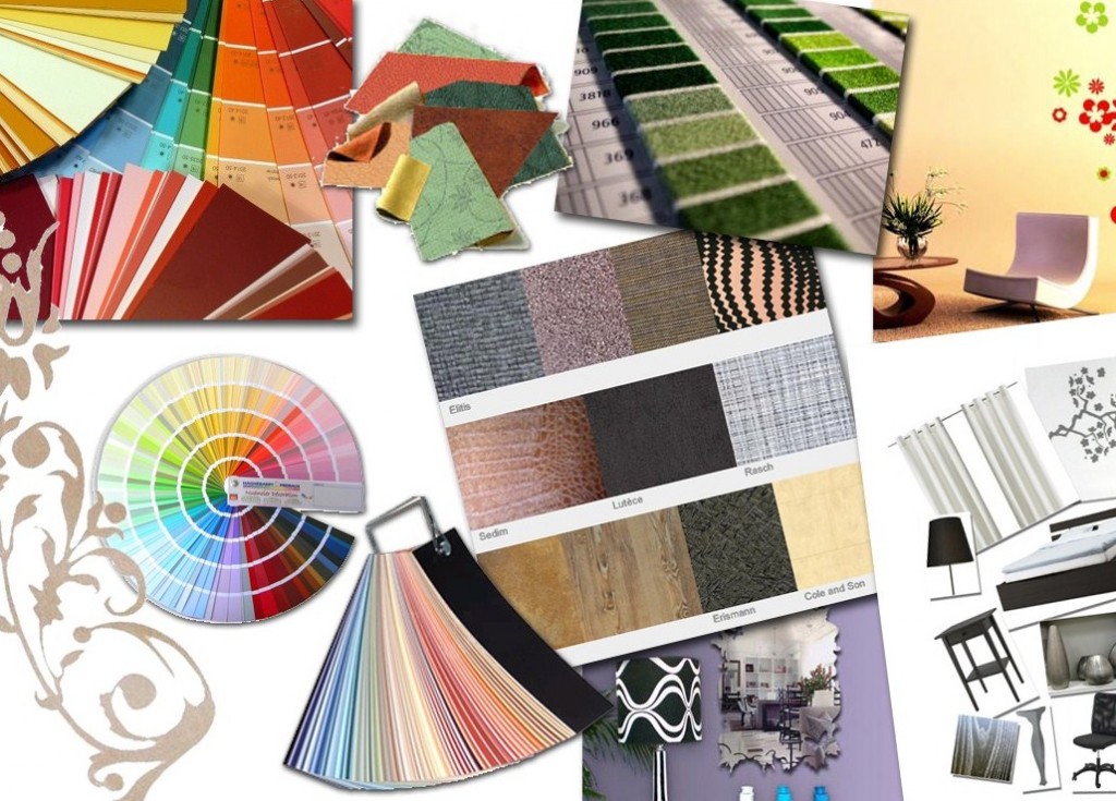
MIXING COLOURS
Some useful tips for furnishing with Mixed Colors: – Excessive use of bright colours can lead to low concentration and make it difficult to relax the eyes especially in children’s bedrooms. – Combine different tones together without ever forgetting that the latter must belong to the same colour gamut in order to avoid reducing the…
-
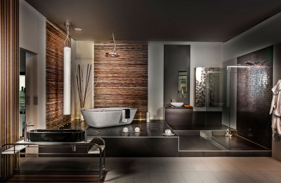
BROWN
The most used colour in interior design! Never aggressive or intrusive, brown is a presence that turns out to be warm, calm and seraphic but never dimmed, does not monopolize the attention and adapts to any environment, whether it be convivial areas or bedrooms. Of great importance when choosing the range of browns is the…
-
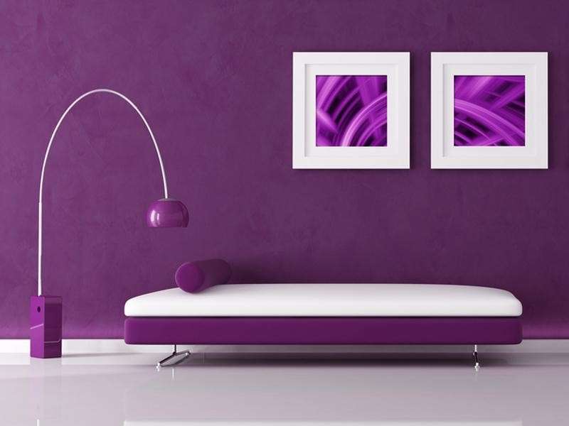
VIOLET
Secondary color that comes from the mixture of red and blue, purple is considered a passionate, refined and romantic color that never goes out of fashion. The versatility and complexity of the purple palette lends itself to countless colour games that combine with daytime spaces, bedrooms and dining rooms. This colour has the ability to…
