

Chromotherapy at home: colours that influence life.

Chromotherapy is the discipline able to create balance and well-being thanks to the interaction between the various colours. Therefore, it is essential to adopt the basic principles of this discipline also at home for a relaxing and serene home environment.

It is well known that color has a strong influence in our lives. This is explained by chromotherapy, a biotherapy that uses colours for therapeutic purposes. In the past very well known and used by different civilizations is now back in vogue and is increasingly combined with the world furniture for its beneficial effects.

Chromotherapy is an integrative medicine that uses colours to rebalance altered energy flows. At the basis of color therapy is the belief that colors can influence the body and mind of the person, in order to restore and promote balance or even control certain disorders.

The therapeutic action of colours is attributed by chromotherapists to multiple effects: colours dilate or narrow blood vessels, increase the production of red and white blood cells and enzymes, support the immune system, strengthen the tissues, favour the transport of oxygen in the blood, extend consciousness.

The combination of interior design and colour therapy is therefore essential to ensure psychophysical wellbeing in the home.

Get the look: Plastic chair
Furnishing houses with colours has taken on a very important role in recent years; it has almost become a furnishing element and often influences the choices of architects and landlords, also with regard to the functionality of the rooms.

Let’s discover together the main features of the colours, so that we can choose the most suitable combinations for our home!
-Yellow: it is a very stimulating colour and usually has an energizing action, as it is the colour of the sun and light. That’s why yellow can even make us happy. It is mainly suitable for the decoration of kitchens or living rooms.

-Orange: it is a colour that is also reminiscent of the sun and heat; it gives energy, but also sensations of fatigue and therefore helps concentration. Suitable for living rooms, corridors, and in small doses in a child’s room.

-Red: is a strong color, which usually has an exciting effect that helps to get out of apathy. Suitable for dining room decoration or, in darker shades, it will look perfect in a kitchen.

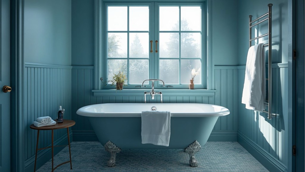
-Blue: is the color of the sky and the sea. It represents calm and large spaces, so it usually has a very relaxing effect, which induces reflection and harmony. Perfect for the bedroom, a small home office or a reading corner.

-Pink is the colour of femininity. Synonymous with delicacy, calm and tranquility. Thanks to its relaxing power, pink is perfect when placed in a little girl’s room or combined with English or Scandinavian style furniture.

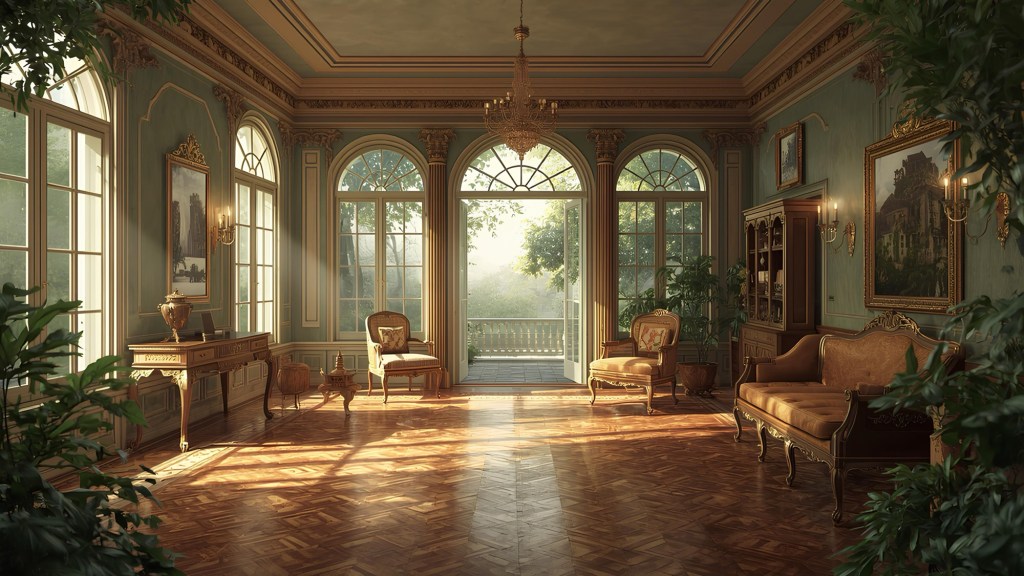
-Green is the colour of nature. It recalls life, strength, fertility; it is reassuring, calming. It adapts perfectly to almost every room in the house, except the kitchen, giving elegance and exclusivity.

-Non-color or neutral. They are white, black and grey. Modern and very elegant, they are shades that will never go out of fashion adapting to any environment, colour and style.

What’s your favourite colour?! Which combinations have you used to decorate your home?!
If you liked my blog post “Chromotherapy: Colours that Influence Life”, have also a look at Decorating with Wallpapers


Leave a comment